
READY TO GO MO?
Take a look at the two phones below. Decide which one you would like to see if you found this website while surfing on your mobile phone:

Of course selecting the phone on the right is the right choice. You can see why a website designed to work specifically on a mobile/smart phone is really needed.
The phone on the left shows what their website looked liked on a SmartPhone before it was optimized for a mobile website. As you can tell, it isn't very user friendly.
Consider a potential customer who is looking for a company to do a loft conversion. With the mobile design version, the visitor can simply click on the button to Call the company or complete a small form to Request a quote. All the important and useful functions are right in front of the visitor and this equates to more people contacting the company.
More and more folks are now using their mobile phones to access the Internet and this means you could be losing potential customers for your business if the website they see on their mobile phone isn't very user friendly.

Guidelines to Improving a Mobile User Experience
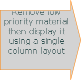
1. Reduce the amount of content
Mobile websites need to be very focused. Only include the most important content or features. This makes easier reading and moving around, as well as quicker loading on devices that can sometime have slow Internet connections.
Mobile websites need to be very focused. Only include the most important content or features. This makes easier reading and moving around, as well as quicker loading on devices that can sometime have slow Internet connections.
2. Single column layouts work best
Wide web pages are difficult to view on a small mobile phone screen. Most text is unreadable until you zoom in to the part you want to view. Zooming isn't ideal because it adds an extra step plus zooming in and out can be confusing and easy to lose your place.
Wide web pages are difficult to view on a small mobile phone screen. Most text is unreadable until you zoom in to the part you want to view. Zooming isn't ideal because it adds an extra step plus zooming in and out can be confusing and easy to lose your place.


Wide Web Page
Single Column Page
Create single column pages using up the whole width of the mobile screen. Additional content should expand downward rather than across since it is easier to scroll down and users generally prefer it.
3. Present navigation differently
Place the main navigation menu in a dropdown format at the top. This leaves more room for other information.
Place the main navigation menu in a dropdown format at the top. This leaves more room for other information.


Menu Closed
Menu Open
4. Minimize text entry
Entering text on a mobile website is much more difficult than a desktop or laptop keyboard. Users tend to make far more errors and are significantly slower when typing. Thus, they really don't want to have to do a lot of typing. Use check boxes and other type of selections to simplify data entry. Also text size should be larger making it easier to view on a small screen.
Also links and buttons should be large enough for a user to press with a finger without accidentally tapping something else.
As you can see, having a mobile website for your business is becoming more important. You could be missing out on a huge and profitable market. Without a mobile web design, potential customers can become frustrated with your existing site and go elsewhere.
It's Time You Have a Mobile Website for Your Business
Contact VCS Website Design to provide a mobile version of your website. Give us a call at 972-547-0706 or go to our contact page for additional options.